Panel Quoting
Designing a new life insurance quoting experience for Kenya
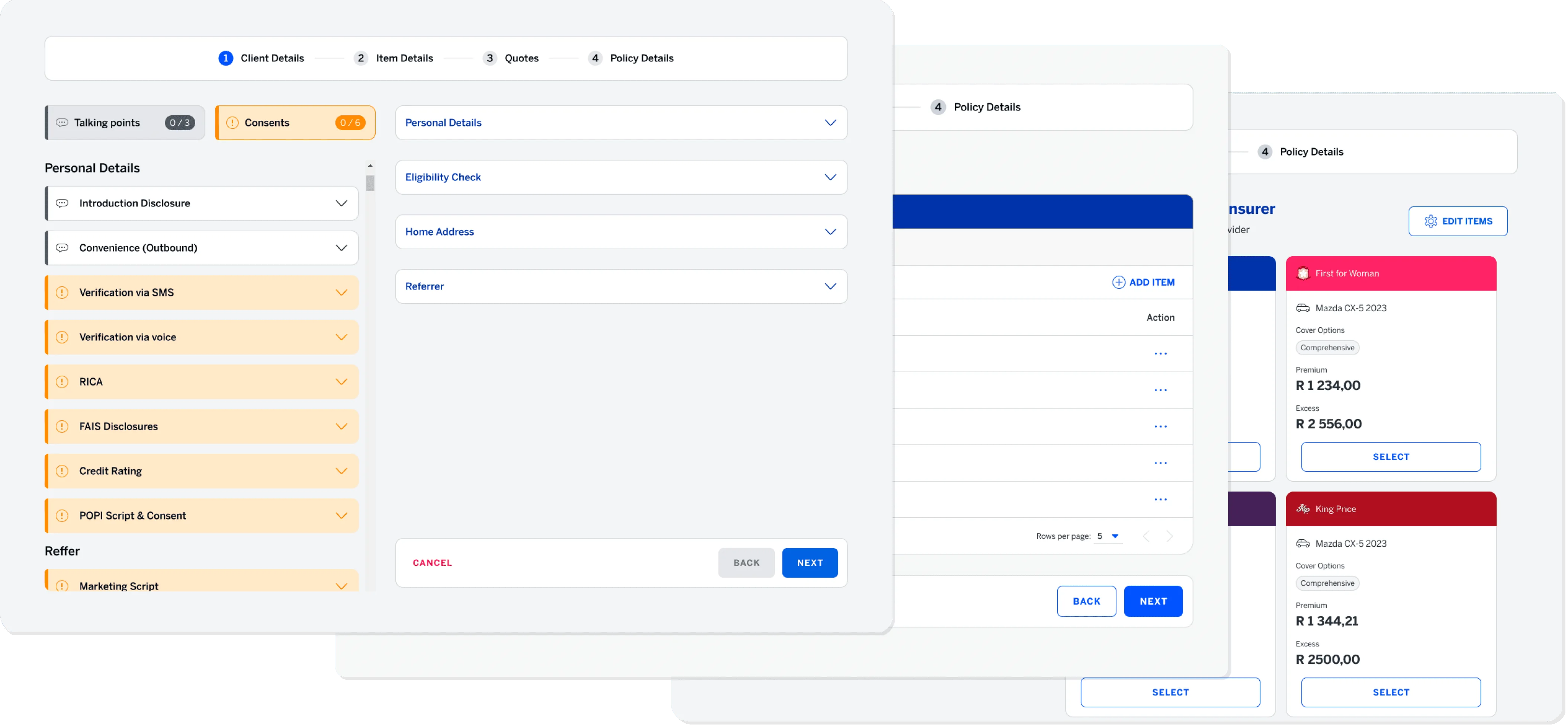
Making a complex product easier to understand
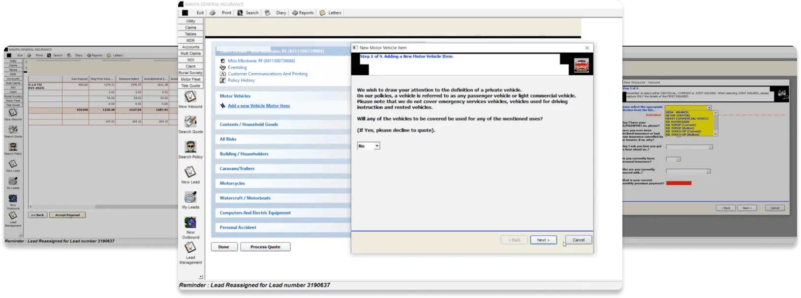
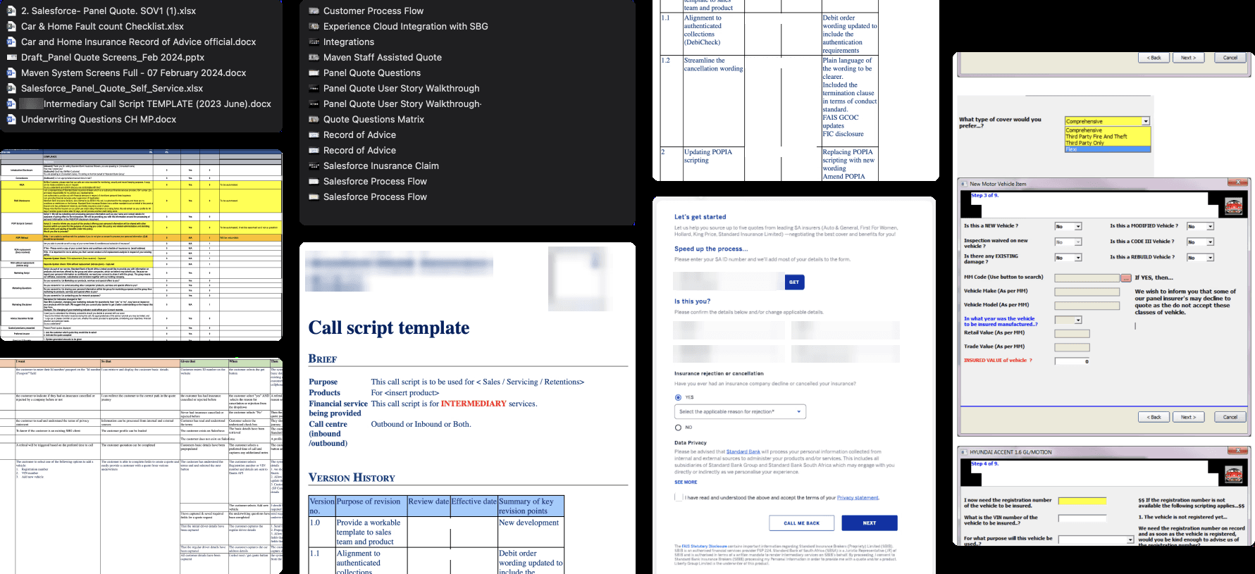
Images of Previous System
We did not have direct access to customers during this phase.
Instead, we worked with Kenyan stakeholders to create four working personas representing different levels of financial confidence, international exposure and insurance knowledge.
They helped us identify likely needs and areas of confusion, but we treated them as hypotheses that still needed customer validation.
The main challenge became clear: the product had to support financially experienced customers without overwhelming someone buying life cover for the first time.
Just three months to finalize MVP1 designs
First quoting tool built on core Omniscript platform
Omniscript’s rigidity forced clever workarounds
What I delivered
Replaced the old UI with a modern, cleaner quoting interface.
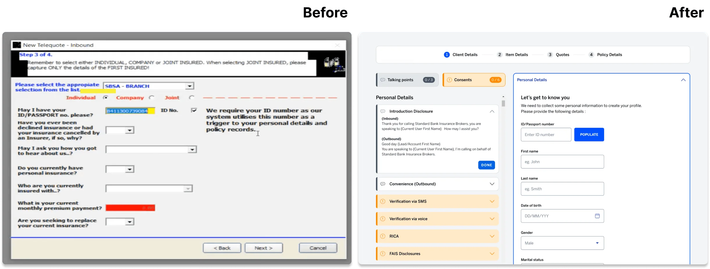
Redesigned with quick scanning and easy reading in mind.
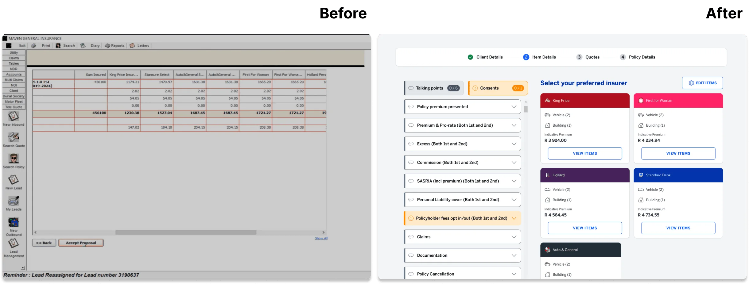
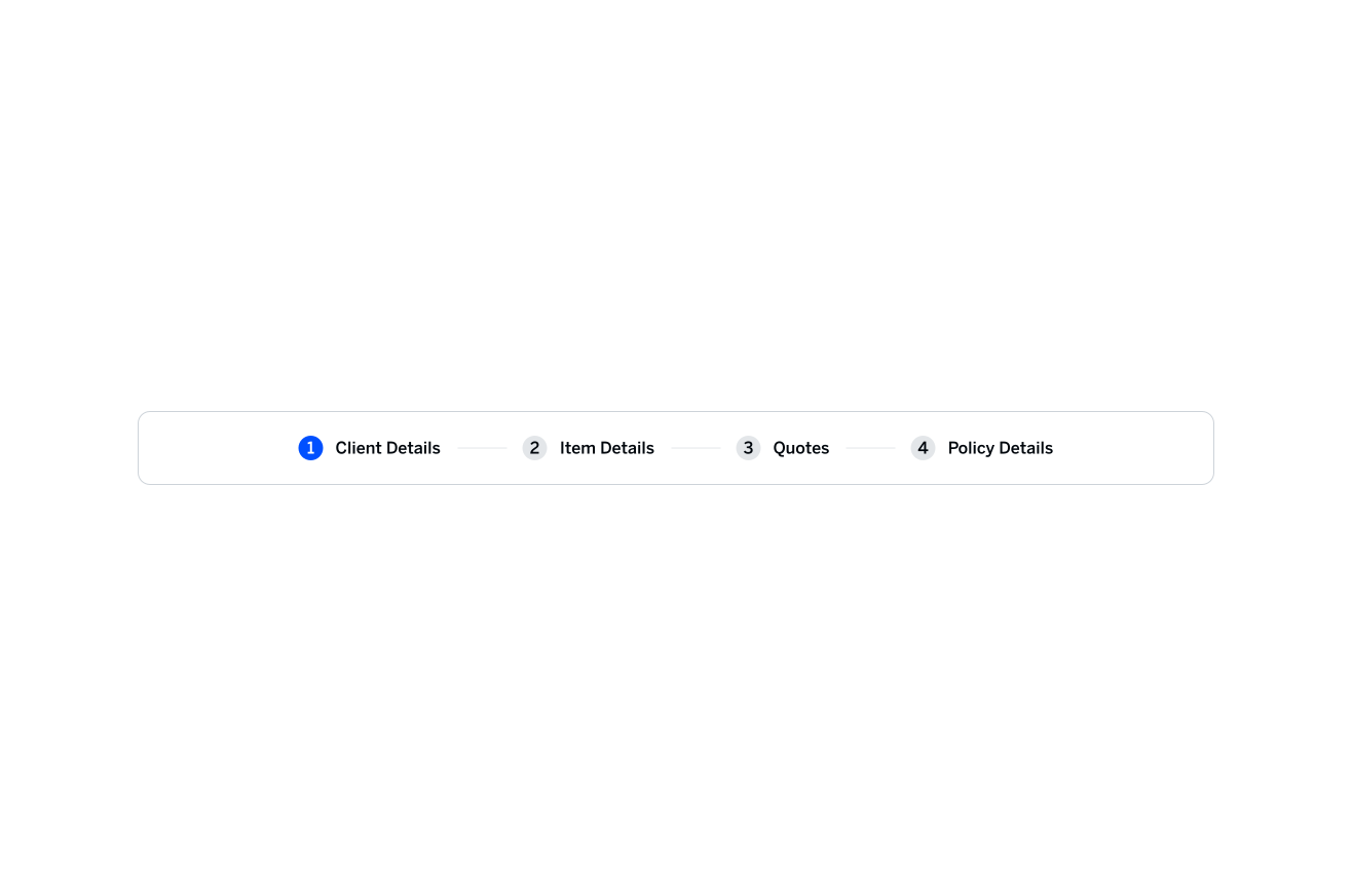
Split the quoting journey into simple, guided steps.
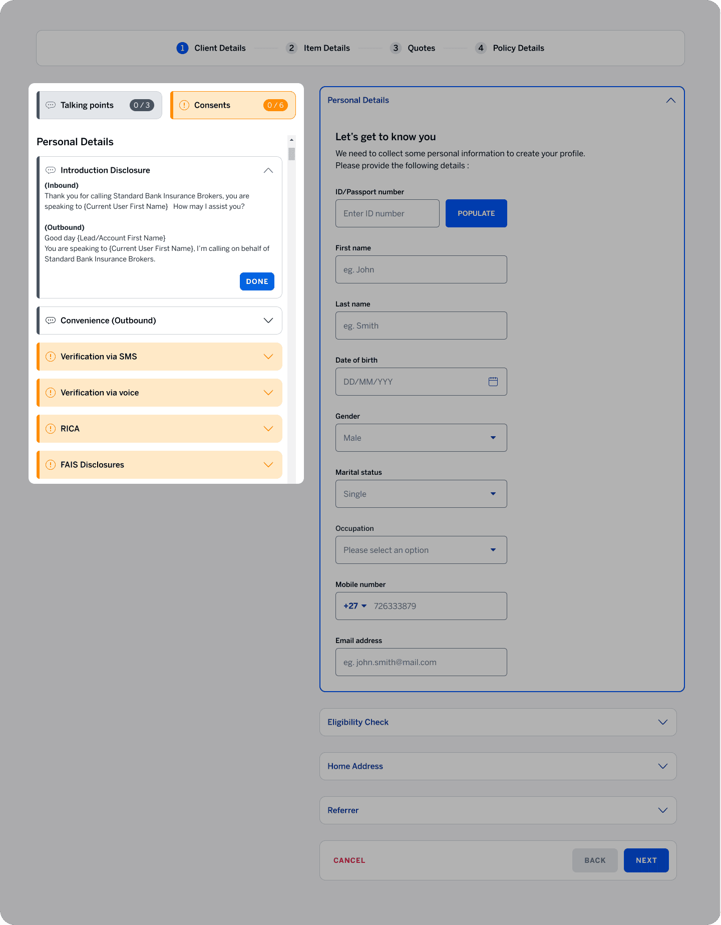
Embedded the call script directly into the system
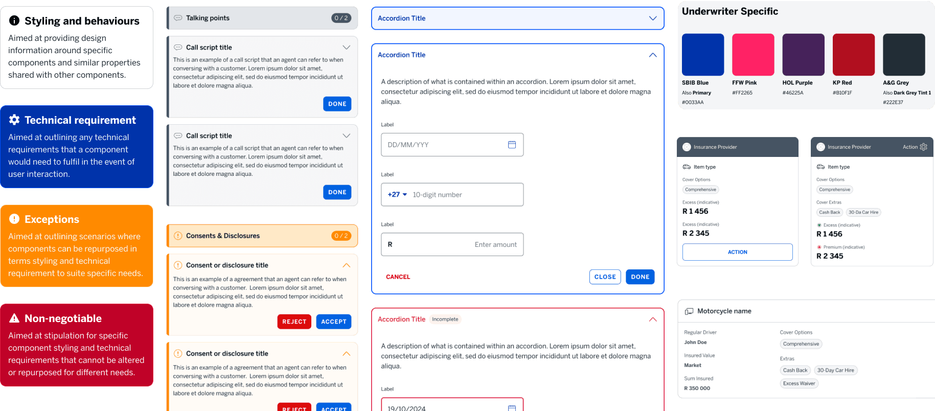
Built a reusable component system to speed up delivery.
How I tackled the challenge.
Identify Business Needs
Review Existing Research
Prioritise
Pain Points
Create
Task flows
Explore Design Concepts
Design & Deliver
MVP 1
I worked within a collaborative design framework, gathering feedback through bi-weekly reviews with senior agents, underwriters, and IT stakeholders.
This process allowed us to refine continuously while staying within Salesforce's limits and aligning closely with agent workflows
Shaping a clear path forward
Pinpointing pain points
I was provided with documents from the discovery phase, which informed my understanding of users and their challenges.
This research surfaced several pain points. In collaboration with the team and stakeholders, we prioritized key issues to address in the first MVP
Agents had to refer to external scripts, breaking their focus.
Constantly switching between systems disrupted the flow.
Laying the foundation
Crafting a smarter, scalable experience
Using research insights and stakeholder feedback, I established three key design goals to guide the quoting experience:
Break the quoting process into clear, manageable steps.
Simplify interactions to reduce cognitive load.
build a flexible foundation that supports future growth and enhancements.
Mapping the flow forward
I developed a detailed task flow diagram showing the ideal quoting journey from initial customer contact through quote generation and presentation.
High-level Car Quoting flow
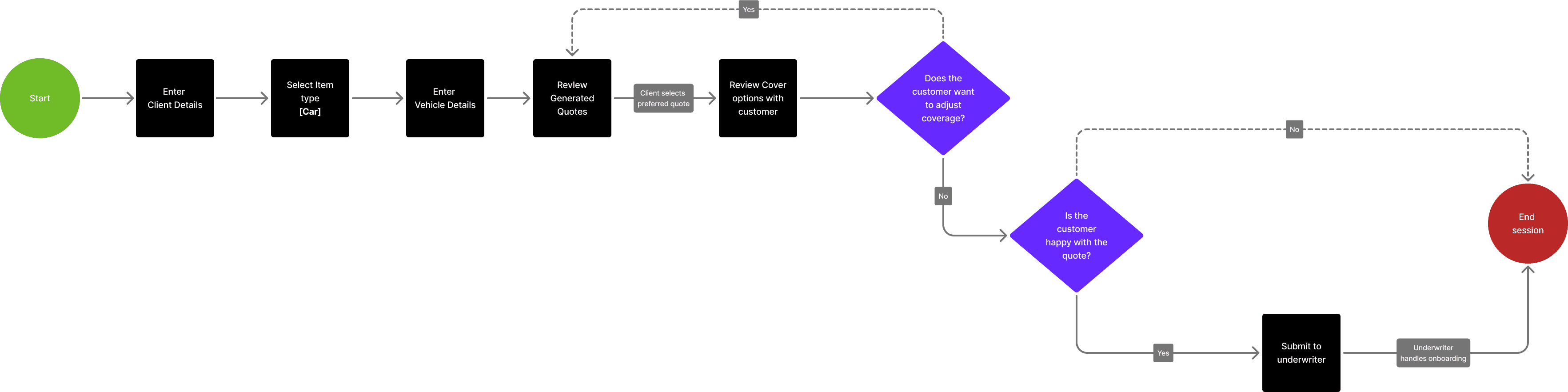
Refining the workflow
While refining the flow, I worked with the product owner and underwriter reps to simplify the quoting forms, ultimately removing 20 unnecessary quoting questions.

Designing for efficiency and scalability
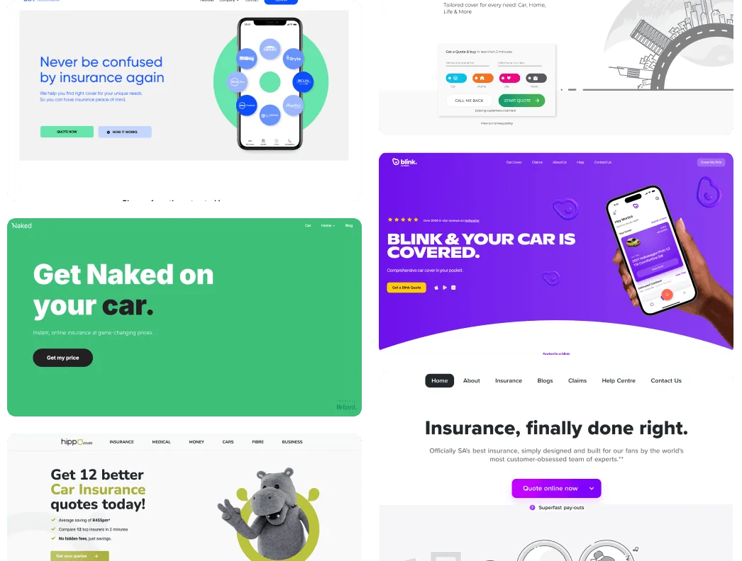
Exploring the landscape
To support differentiation, I analyzed competitor quoting platforms. This benchmarking confirmed our focus on building a simpler, faster experience tailored to agent workflows.
Choosing the layout
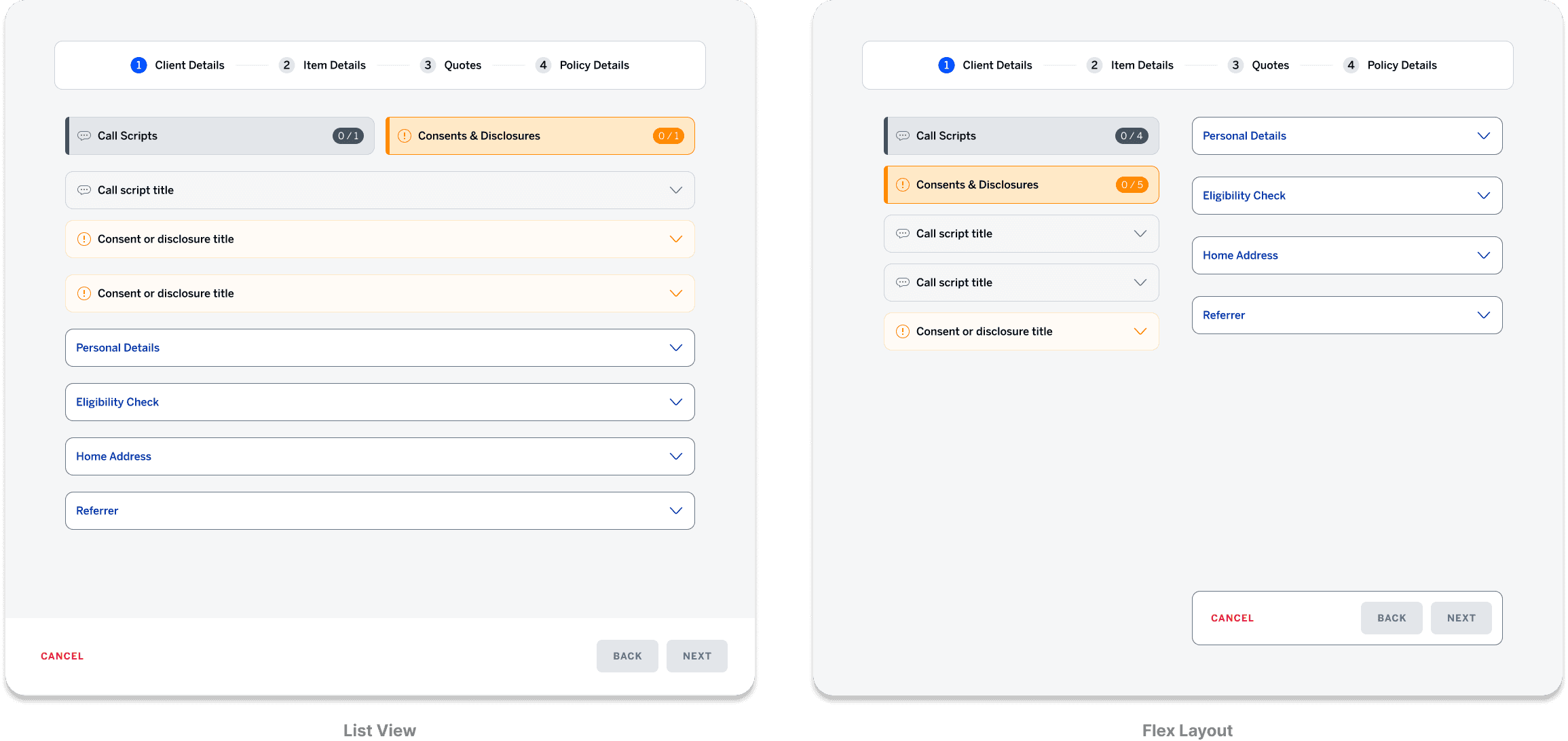
I then started design by exploring both list and flex layouts and determined that a flex approach best suited user needs.
Given Salesforce’s limitations and agent feedback, this structure provided a faster, more intuitive workflow while maintaining system stability.
Building a custom design system
To speed up development and ensure consistency, I worked with my senior designer to build a component library using elements from both Standard Bank and Salesforce design systems.
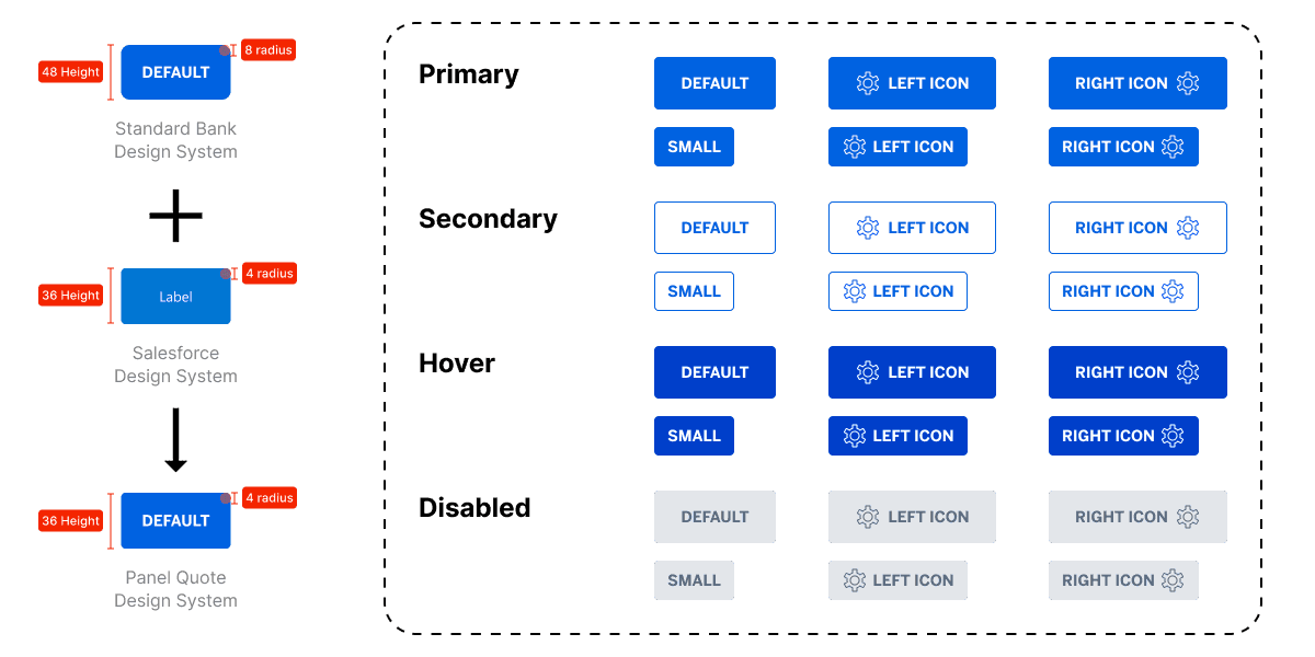
Example of design system customization
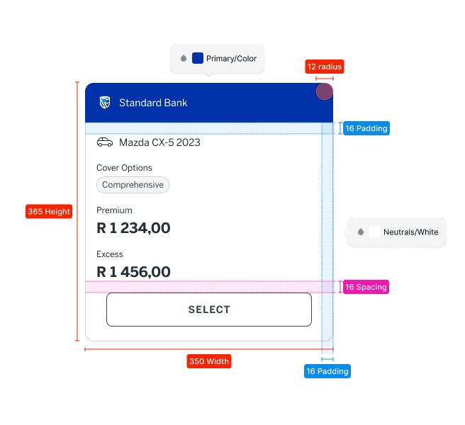
Quote card
Streamlined data entry
With the foundational design system in place, I turned to the Client Details page. I designed this page to be minimal and efficient, featuring an auto‑fill function for client IDs. An always‑visible call‑script panel provides contextual guidance and essential disclosures, ensuring accuracy and easing the data entry process right from the start.
Active use of Talking points and ID fill
The coverage hub
Next, was the Item Details page, a dynamic table that centralizes all insurable items for quick viewing and comparison.It allows agents to add or remove items based on customer requests, streamlining current processes while being built for future scalability.
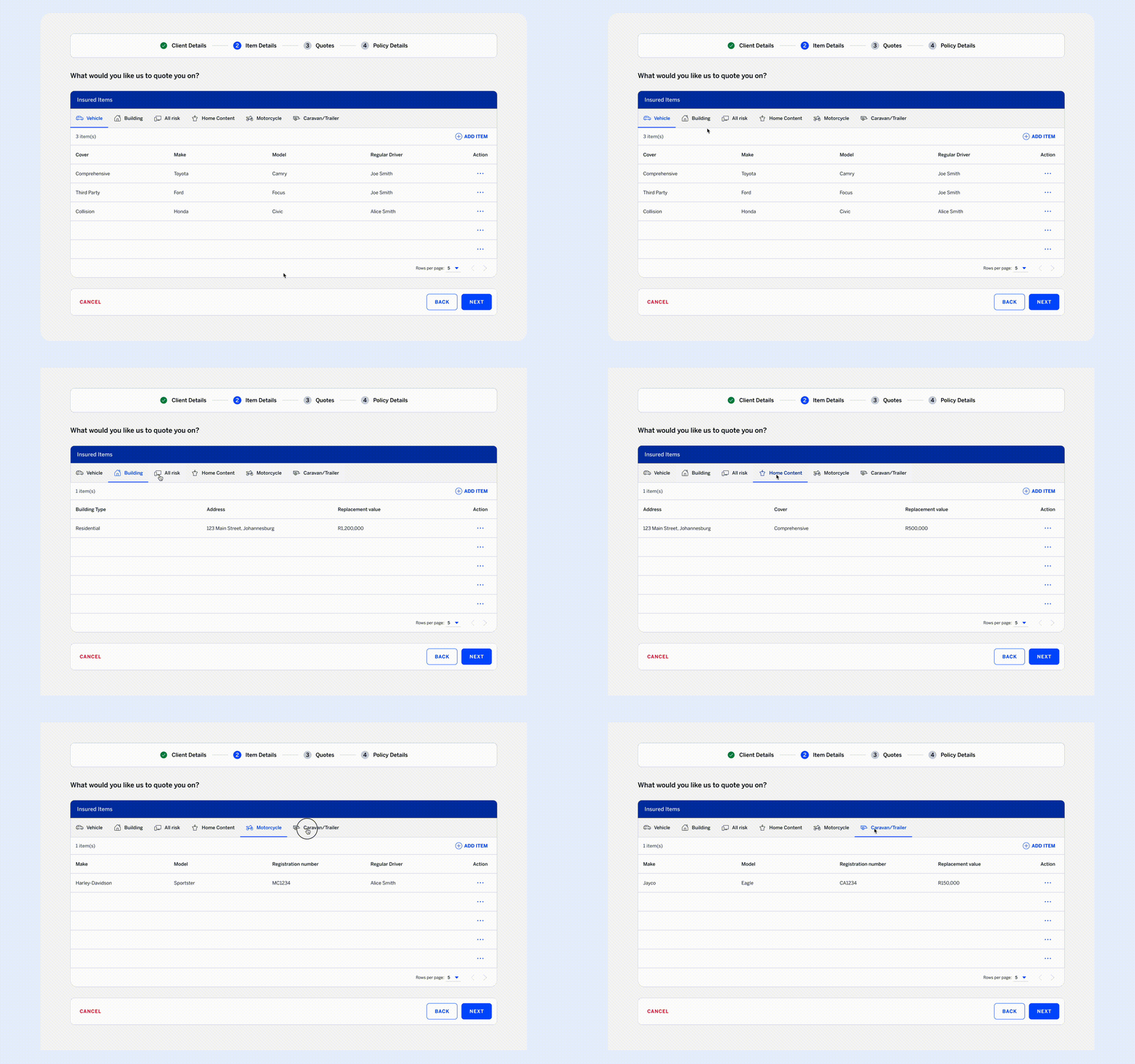
Item details nexus table
Overcoming platform limits
For the quote results page, I initially designed a cart-style layout that allowed agents to select different underwriters for individual items. However, integration testing revealed legacy API limitations that made dynamic, per-item selections unstable and unfeasible.
Cart like quote page
To address this, I adapted the design to a bucket-style system, where agents select one underwriter for all items in a quote. This approach preserved clear side-by-side comparisons while ensuring system stability and simplifying the quoting workflow.
Updated bucket style quote page
Delivering the final product
Final delivery
We delivered a scalable quoting experience within Salesforce by streamlining workflows, removing 20 unnecessary quoting questions, and simplifying navigation.As a result, quoting time dropped by 28%(pending live testing)., and the new system achieved a 5/5 CSAT score from stakeholders at launch.
Reflections and next steps
This project reinforced two key lessons:
- Design must start with empathy, solving real user needs over surface-level polish.
- Quality depends on iteration, using continuous testing and feedback to prevent costly rework.
With MVP 1 live, the focus shifts to MVP 2: expanding functionality, refining workflows, and exploring dynamic multi-quote comparisons and further UI optimizations based on agent feedback.